User Engagement (UX Case)
Summary
After realizing that a significant portion of our users was creating their designs outside the studio and importing them, we recognized that the studio experience was genuinely primitive. By incorporating features from popular design tools (crop, color picker, rotate, etc.) into the studio, we aimed to encourage users to use the studio and continue the entire process through Storyly Studio.
With the changes in this article and more, we noticed a significant acceleration in content creation, making the object alignments easier. In the previous version of the studio, as there was no right pane, users had to open a modal for each interaction. With the introduction of the right pane, we observed a serious reduction in interaction costs through Fullstory.
Overview
Since image carousels are getting boring and useless for the marketing engagement experiences, Storyly came up with a clever idea and they invented brand generated story experience for the companies. Storyly is a platform to increase user engagement and retention for mobile apps and websites. The main product is a CMS and Studio. And these platforms provides to brands, web and mobile plug-in to have Instagram-like story experience on their interface.
My role: Product Designer
Platform: Web
Year: 2022 - 2023
What
Revamping Design Studio interface by taking into account customer pain points and UI/UX trends.
⚠️ I cannot share the entire project as it is under the scope of an NDA.
Who
We completed the project with a total of 5 designers, conducting multiple brainstorming sessions. The entire product team was involved in the process through our workshops, where we brought together and filtered out various ideas.
Proud design team ❤️ Selin Aydemir, Güven Sözmen, Melike Sherifi, Beyza Erik, Ammer Ceker
Competitors

Screens
✸ Get started
The empty studio view you will see when creating a new Story Group within the Instance is as follows. From here, you choose the option that suits you and create your canvas.
Additionally, you can create more than one Story Group within each Instance. After entering a Story Group from the dashboard and transferring to the Studio, we introduced a header structure that allows you to switch to other Story Groups.


✸ Color Picker
We turned the color picker into a dynamic element that can be used throughout the studio. Previously, there was only a picker where specific colors could be selected, limiting users. We examined dozens of tools for an industry-standard color picker and incorporated the most suitable solutions into our designs.

You can see various states of the color picker component below.


✸ Image crop
In the previous version of the studio, due to the lack of a Redux infrastructure, we could only perform a quite primitive cropping. After the introduction of the Redux infrastructure, we made this feature universal.


✸ Picker improvement
When the studio was initially built, we experienced some compatibility issues and functional shortcomings in certain components due to the use of Ant Design. To address these issues, we redesigned this component as well.


✸ Live preview
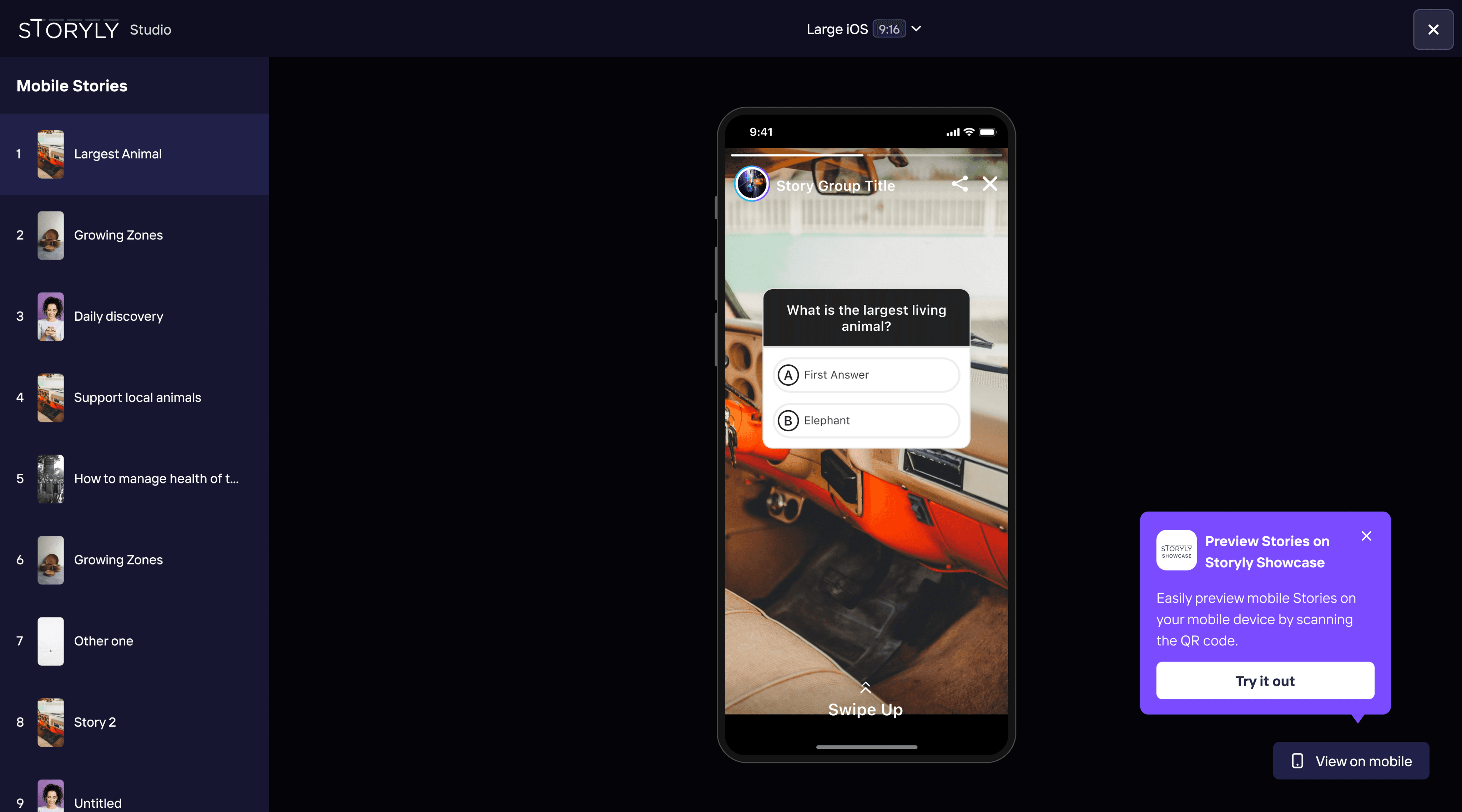
Since stories will be viewed on various devices, it is often crucial to see how the designs look when creating them. Although panel users use a test environment to test stories, they didn't always find it appealing to rely on this method. In the examples below, we identified the most common breakpoints for the user base and created a live preview area.


✸ Object rotation
In the previous version of the studio, rotating elements was not possible. Here, we aimed to bring the most suitable structure to our technological infrastructure by benchmarking from design tools and photo editors.


✸ Object alignment
In the previous version of the studio, due to the lack of a Redux infrastructure, we could only perform a quite primitive aligment. After the introduction of the Redux infrastructure, we made this feature universal.
Distribution Formula
x = the total space between the selected objects
x - number of objects / 2 = the new spacing value between objects after clicking distribute


✸ Keyboard shortcuts
The keyboard shortcuts were not available in the previous version, and creating pixel-perfect designs was quite challenging for users. We have introduced these features and prepared a guide regarding shortcuts.